Template 5: Compact Brochure Page Layout in DFM2HTML
Template 5 is built around a specific content pattern: the brochure page. This is a page that introduces a product, service, or business with a focused presentation, a defined visual weight, and a clear stopping point. It is not a documentation page or a long-form article. It is a compact, purposeful page that says what it needs to say and directs the reader toward a next step. Template 5 is the structure DFM2HTML provides for building exactly that kind of page.
Template Concept
Brochure pages have a different contract with the reader than documentation or tutorial pages. Documentation asks the reader to follow along, to absorb a sequence of information in order. A brochure page asks the reader to evaluate: is this what I was looking for, and does it give me enough reason to act? That difference in intent drives a different layout approach.
Template 5 uses a narrower, more defined content zone than Template 1. The page does not try to use the full browser window width. Instead, it keeps content in a column that feels intentional and complete, with visual breathing room on both sides. This gives the page a composed, deliberate feeling rather than the expansive, open feeling of a long-form content page.
The structure is horizontal-band friendly. Template 5 accommodates a header zone, a brief introductory section, a feature or benefit block, a supporting detail section, and a closing call to action, all within a compact vertical span. The page is designed to be readable in a single scroll on most screens, which matches how people engage with brochure-style content.
Layout Anatomy
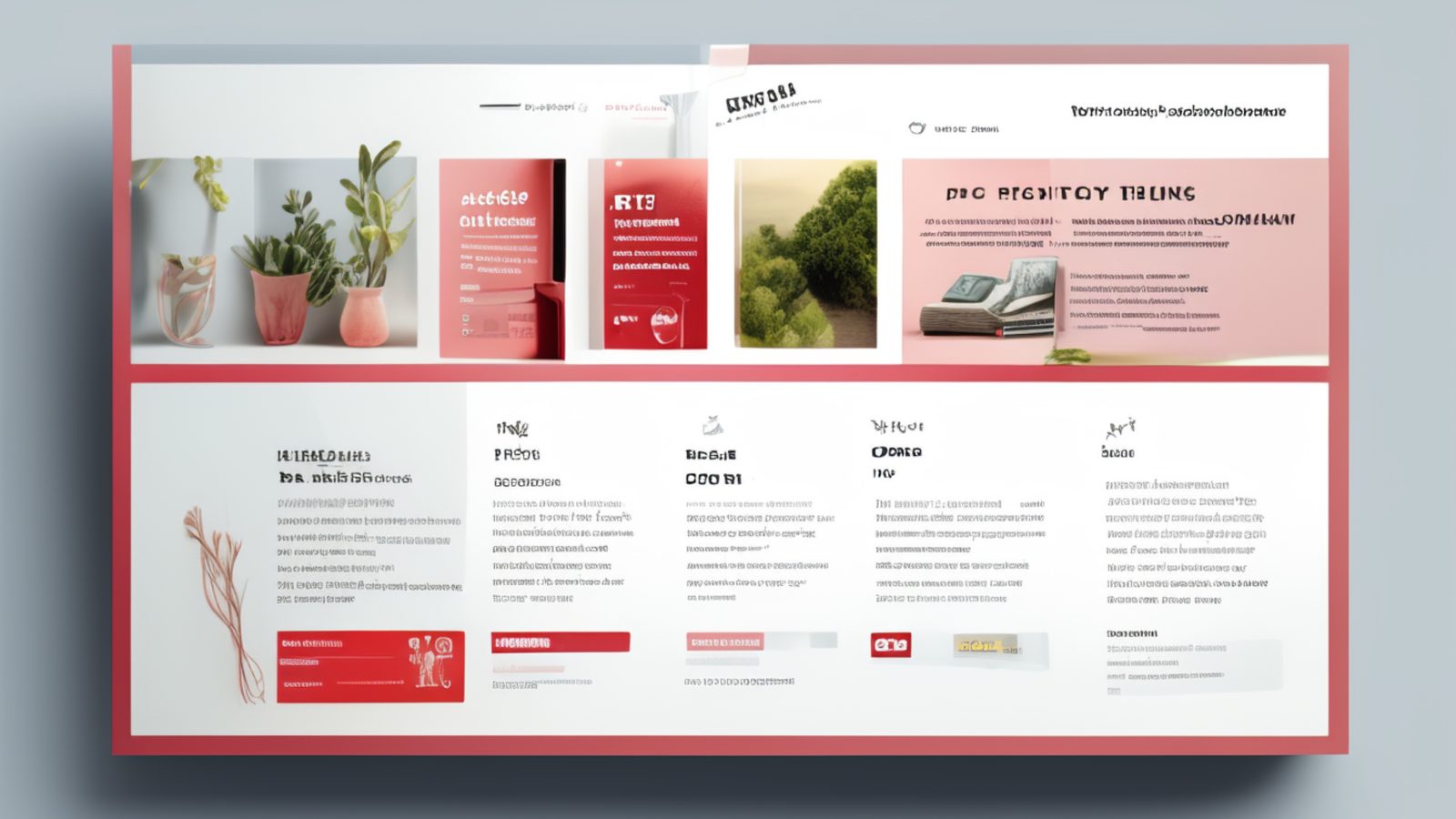
Template 5 has a header at the top with a site name or logo area and a simple horizontal navigation bar. Below the header, the main content zone is centered on the page with defined maximum and minimum widths. Unlike Template 1, which uses the full container width for content, Template 5 constrains the content column to a narrower range that produces a tighter, more formatted appearance.
Within the main content zone, the layout supports a prominent top section, typically an image or a short headline block, followed by content blocks arranged in a single column. The separation between content blocks is achieved through vertical spacing and horizontal rules or background color bands rather than through additional columns.
Template 5 includes a visual treatment for the top of the page below the header: a designated space for a hero image or a large headline that sets the page's visual tone before the body content begins. This is the layout's strongest visual element and the most important thing to get right when customizing the template. A well-chosen image or headline in this zone does more communicative work than all the body copy below it.
The footer in Template 5 is compact by design. It contains the minimum required information: copyright, contact link, and any required legal notice. This keeps the page ending cleanly rather than trailing off into an extended footer block.
Where Template 5 Works Well
Product pages for single products or product lines are the primary use case. A page that describes one piece of software, one physical product, or one defined service package fits naturally into the brochure structure. You present the product, explain the key points, address likely questions in brief, and close with a purchase, download, or contact link.
Service pages for small businesses work well here. A plumber, a freelance designer, a cleaning company, or a consultant describing a single service offering has exactly the right amount of content for Template 5. The page is long enough to be credible, compact enough to hold attention, and structured enough to feel professional.
Landing pages designed to capture a response to a specific campaign benefit from the compact, focused character of Template 5. The layout does not encourage browsing or exploring; it keeps the reader's attention on the material in front of them and points toward one action.
Event pages and announcement pages are another strong fit. These pages have a natural content shape: what the event is, when and where it is, who should attend, and how to sign up or register. Template 5 handles this shape without requiring the reader to scroll through extensive copy to find the essential information.
Navigation Pattern
Template 5 uses a horizontal navigation bar in the header, following the same pattern as Template 1. Because brochure pages are typically part of a small to medium site where the full page list fits in a horizontal nav, this approach works well. Visitors arrive, see the site-wide nav at the top, and can move to any other section without effort.
Within the page itself, internal navigation is minimal or absent. Brochure pages are not designed for non-linear reading; they have a beginning, a middle, and an end, and the reader is expected to move through them in order. Jump links within the page are unnecessary unless the page is unusually long for its type.
If you are using Template 5 for a set of related product or service pages, consider adding a secondary nav block within the content zone that links to sibling pages. Placing this at the bottom of the page, after the main content but above the footer, lets readers move between related brochure pages without returning to the top-level nav.
Template 5 pages work effectively as destinations from a parent index page. A services overview page built with a different template can link to individual Template 5 service pages for each offering, creating a two-level structure where the overview provides the navigation and each Template 5 page provides the depth.
Responsive Concerns
Template 5 handles small screens better than two-column layouts because there is nothing to restack. The content zone is already narrow by design, so the reduction in width from desktop to mobile is smaller and less disruptive than on a full-width layout.
The main responsive concern is the top hero zone. On desktop, this area is wide enough for a landscape image with room for headline text beside or over the image. On a phone screen, the same image may need to be treated differently: either cropped to a portrait or square ratio, or displayed with the headline below it rather than overlaid. Review the top section on a small screen before publishing if it uses any image-text combination in the hero area.
Horizontal padding is important on Template 5 at mobile sizes. The compact content zone that looks intentional on a desktop screen can feel cramped if the side padding is reduced to zero on a phone. Maintain at least a small padding value on both sides to keep the content from pressing against the screen edge.
Call to action buttons or links at the bottom of the page should be large enough to tap comfortably on a touch screen. If your closing action is a text link, consider styling it as a button-like element for mobile visitors. The editor's CSS tools can apply a block display with padding and a background color to a link without changing its desktop appearance, using a simple mobile media query.
Related Templates
For longer content that outgrows the brochure format, Template 1 provides the same single-column approach with a wider, more expansive content area suited to articles, tutorials, and extended documentation rather than focused promotional pages.
For sites where brochure-style pages need to sit alongside a richer multi-section structure with distinct visual zones, Template 8 provides a multi-region layout that handles more complex page architectures while keeping the content organized and readable.